圣杯布局的实现,有很多种。大致都是借助 padding, margin, float之类的,当然...
圣杯布局的实现,有很多种。
大致都是借助 padding, margin, float之类的,当然这是传统的实现方式。更多的参考方式圣杯布局小结.
这里说的是用css3 cal 和flex来实现,因为css有限,有不当或者错误之处,敬请指出。
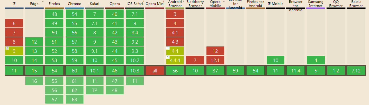
css3 cal 的支持情况,总体 93%。
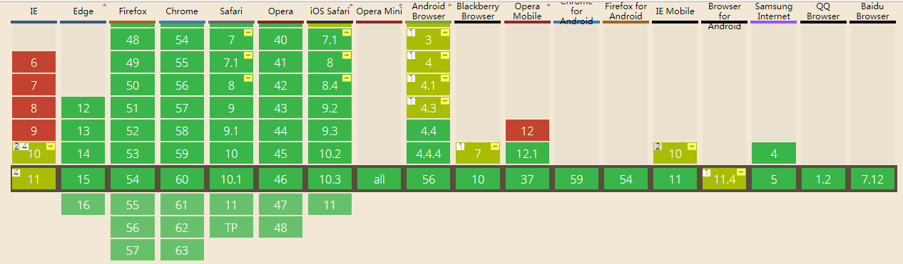
flex布局的支持情况, 总体97%
为了增加复杂度
1. 块之间有间距
2. 有 border
3. 都采用了 box-sizing: content-box
先看 calc的实现
<!DOCTYPE html><html lang="en"><head> <title>css3 cal</title> <meta charset="UTF-8"> <meta name="viewport" content="width=device-width, initial-scale=1"> <style> html, body { height: 100%; width: 100%; margin: 0; padding: 0; box-sizing: border-box } .header { background: red; height: 100px; } .footer { height: 100px; position: absolute; bottom: 0; width: 100%; box-sizing: border-box; background-color: palevioletred } .header, .footer, .left, .content, .right { border: 10px solid black; box-sizing: border-box } .left { margin: 20px 0; background: green; width: 100px; } .content { margin: 20px 20px; background-color: silver; width: calc(100% - 240px); width: -webkit-calc(100% - 240px); width: -moz-cal(100%-240px); } .right { margin: 20px 0; background-color: yellow; width: 100px; } .left, .content, .right { float: left; height: calc(100% - 240px); height: -webkit-calc(100% - 240px); height: -moz-cal(100%-240px); } </style></head><body> <div class="header">header</div> <div class="left">left</div> <div class="content">content</div> <div class="right">right</div> <div class="footer">footer</div></body></html>
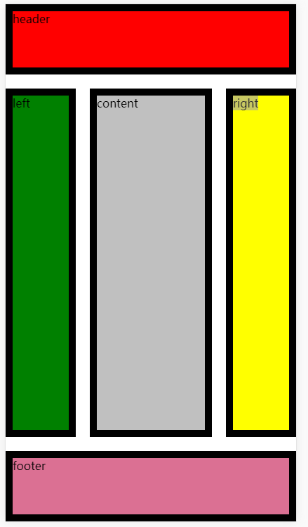
效果
现在看flex的实现方式
<!DOCTYPE html><html lang="en"><head> <title></title> <meta charset="UTF-8"> <meta name="viewport" content="width=device-width, initial-scale=1"> <style> html, body { height: 100%; width: 100%; margin: 0; padding: 0 } body { display: flex; flex-direction: column; } .header { height: 100px; background: red; } #container { display: flex; flex: 1 1 auto; margin: 20px 0; } .left { background-color: green; } .right { background-color: yellow; } .content { flex: 1 1 auto; background-color: silver; margin: 0 20px; } .footer { height: 100px; width: 100%; background-color: palevioletred } .left, .right { flex: 0 0 100px; } .left, .right, .content, .header, .footer { box-sizing: border-box; border: 10px solid black; } </style></head><body> <div class="header">header</div> <div id='container'> <div class="left">left</div> <div class="content">content</div> <div class="right">right</div> </div> <div class="footer">footer</div></body></html>
效果:
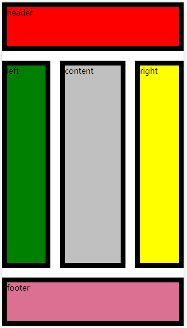
效果是一样的,都只是拉伸缩放自动填满。
但是都把 box-sizing: border-box 删除掉的时候,会发现 calc已经坏掉了,但是flex依旧没有发生混乱。
这就是我为什么爱flex的原因。 还有这么复杂的去计算,真心的类,支持度还没flex高。
难道是我还是太年轻吧。
引用:
版权声明
本文仅代表作者观点,不代表百度立场。
本文系作者授权百度百家发表,未经许可,不得转载。
上一篇:koa2 中间件里面的next到底是什么 下一篇:Binlog相关说明