css动画
首先要明白动画是一帧一帧的,由多个帧拼起来的动画
@key s
此为动画样式中的关键帧,用关键帧来控制css动画中的关键样式。相比较过渡更加的容易空值中间的部分
其指示了一个过程到另一个过程的过程
关键帧还具有名字,在应用的时候通过名字将其绑定。
如果关键帧重复定义,则根据最后一次定义为准
关键帧中的important会被略过
举个栗子
定义一个关键帧
@key s my s { form { background:#a7e5c6; width:100px; } to { width:90%; background:#c6c2a3; }}样式如下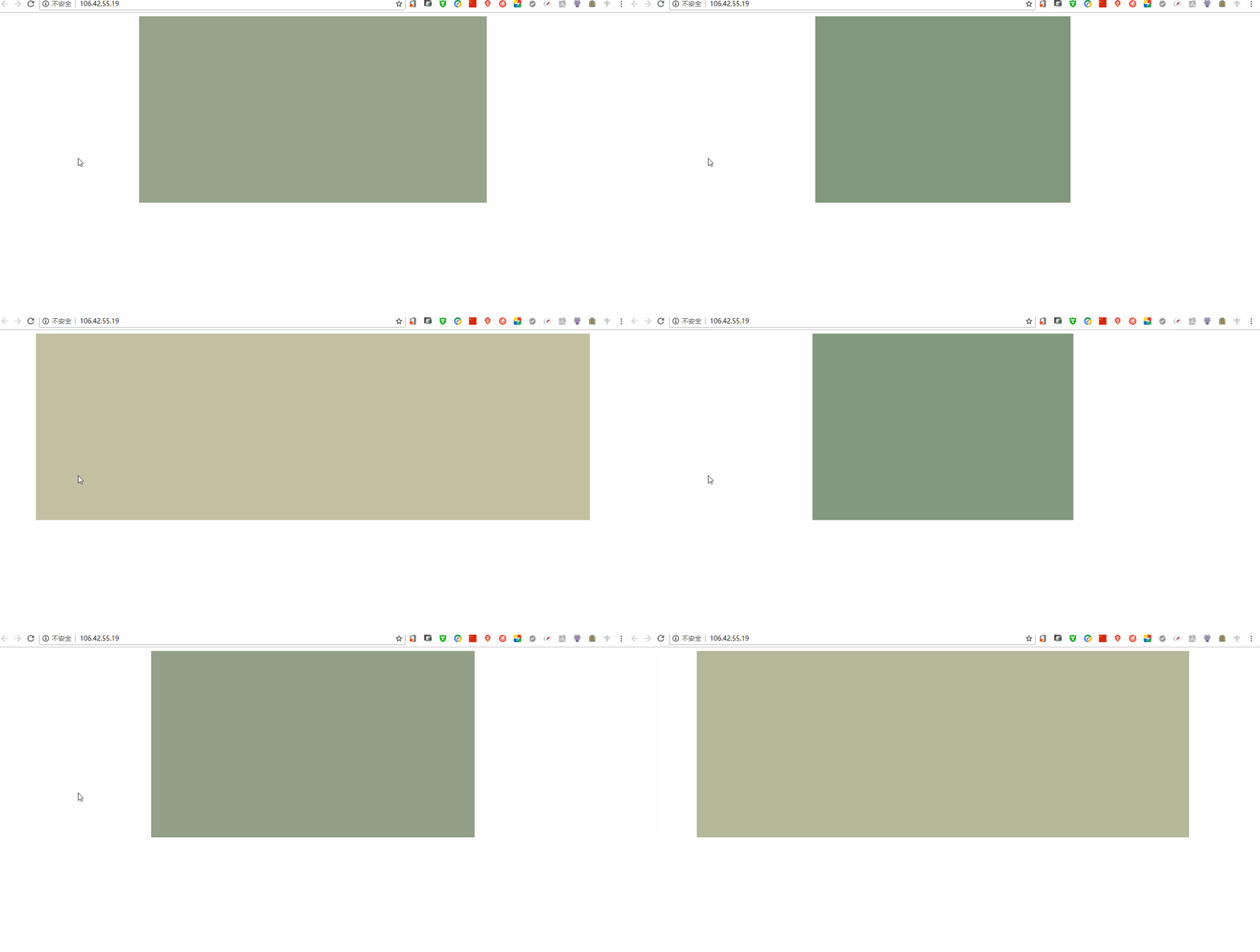
这样就完成一次动画操作
分开定义
也可以进行分开定义
按照百分号进行定义,结果如下
关键帧如下
@key s my s { 0% { width:200px; background:#827e64; } 20% { width:400px; background:#86bece; } 50% { height:600px; background:#af92aa; } 90% { width:300px; height:400px; background:#698771; }}效果如下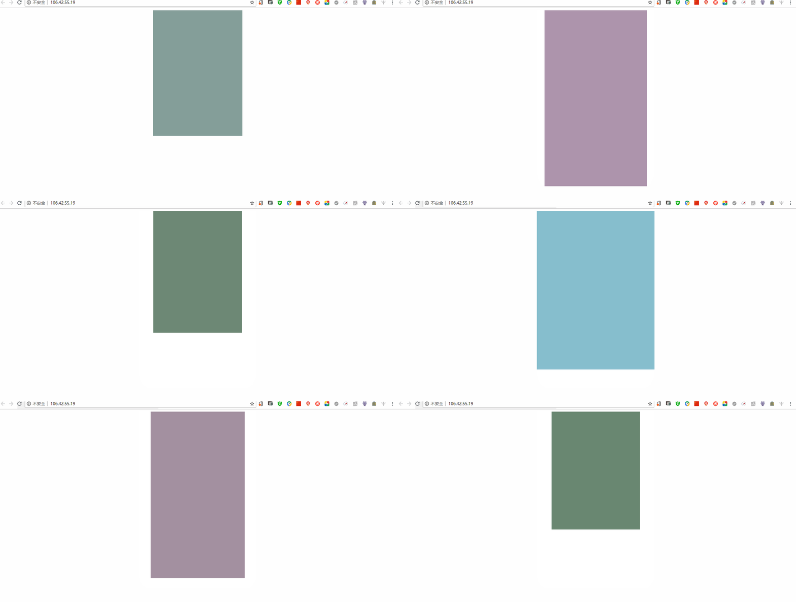
animation
animation 同样是一个简写属性,相比较js写动画来说,css动画已经灰常简单了。
大概看了一点纯js动画,js动画核心在于对css样式的更改,外加一个重复时间对css不断的累加得到动画效果
下面依次说明
animation-name
和关键帧进行绑定
必须和关键帧的名字相同(废话)
animation-duration
指定一个动画的周期
负值的动画无效
举一个栗子
div { width:300px; height:400px; background:#698771; margin:auto; animation-name: my s; animation-duration:.9s;}/*关键帧*/@key s my s { 0% { width:200px; background:#827e64; } 20% { width:400px; background:#86bece; } 50% { height:600px; background:#af92aa; } 90% { width:300px; height:400px; background:#698771; }}动画效果如下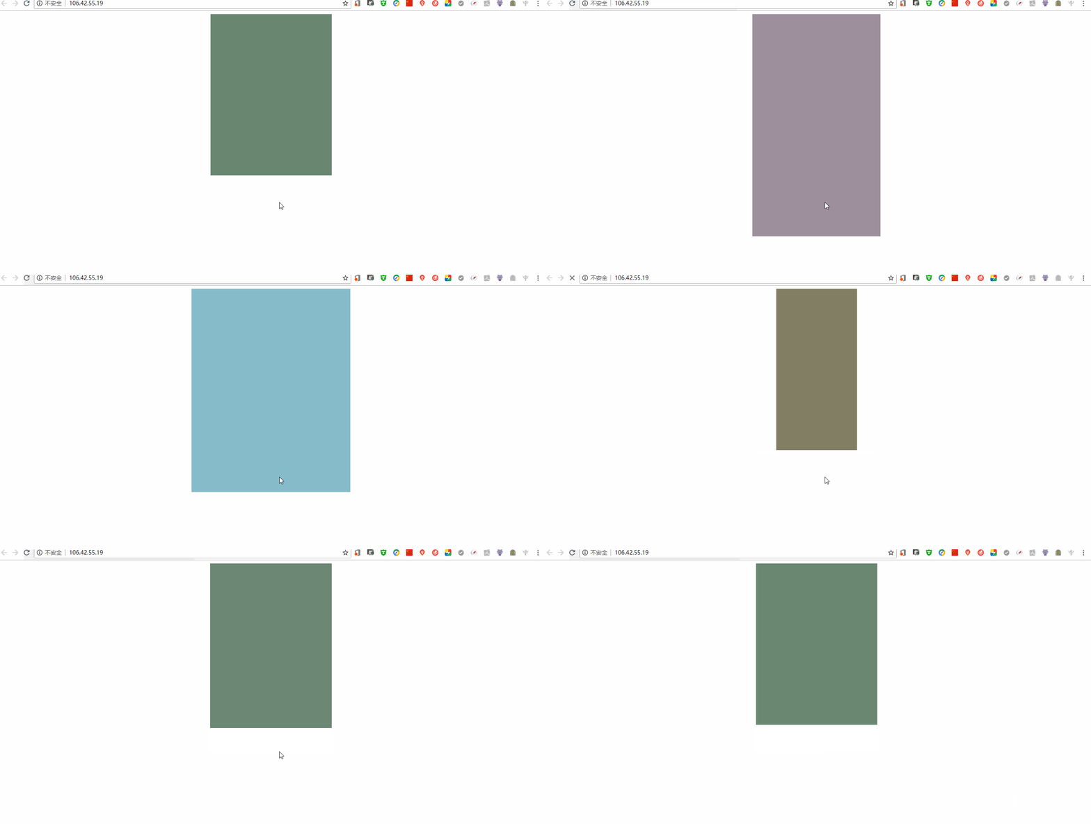
animation-timing-function
定义一个动画的过程,类似于过渡的函数
同样的,有贝塞尔曲线等等
不在阐述
DevTools
谷歌浏览器的调试工具具有该方法,可以直接使用调试工具绘制贝塞尔曲线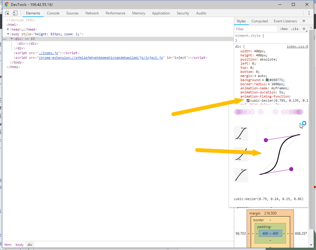
animation-delay
定义动画的延迟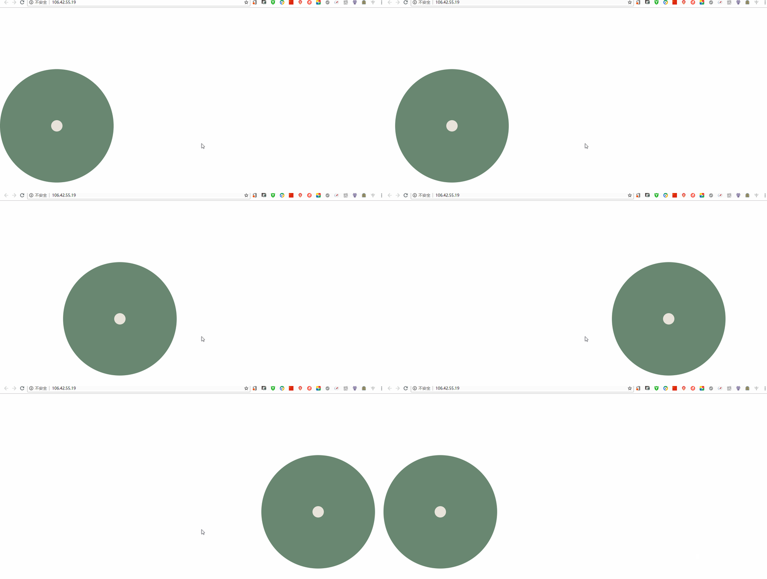
css如下
* { margin:0; padding:0;}body { position:relative;}div { width:400px; height:400px; position: absolute; left:0; top:0; bottom:0; margin:auto; background:#698771; border-radius:1000px; animation-name: my s; animation-duration:5s; animation-timing-function:cubic-bezier(0.785, 0.135, 0.15, 0.86); animation-delay:.9s;}div div { width:40px; height:40px; position:absolute; left:0; right:0; top:0; bottom:0; margin:auto; background:#e8e3da; animation-name:myCenter;}/*关键帧*/@key s my s { from { left:0; } to { left:70%; }}@key s myCenter { from { left:0; } to { left:0; }}html如下
<!DOCTYPE html><html><head> < charset="utf-8"> < rel="stylesheet" href="./index.css" type="text/css"> < >css动画</ ></head><body> <div> <div></div> </div></body></html>< src="./index.js"></ >动画延迟了0.9秒
animation-iteration-count
定义动画的迭代次数infinite 为永远重复
数值为number
举栗子
animation-iteration-count:3;动画重复播放3次。
animation-iteration-count:infinite;动画永远重复播放
animation-direction
定义是否向前,向后,是否交替来回
如果想要重复的多次播放,必须有animation-iteration-count的值为infinity否则不会出现重复播放
normal
为一个每次重复重新的位置开始播放(每次都将重置为新状态,开始执行)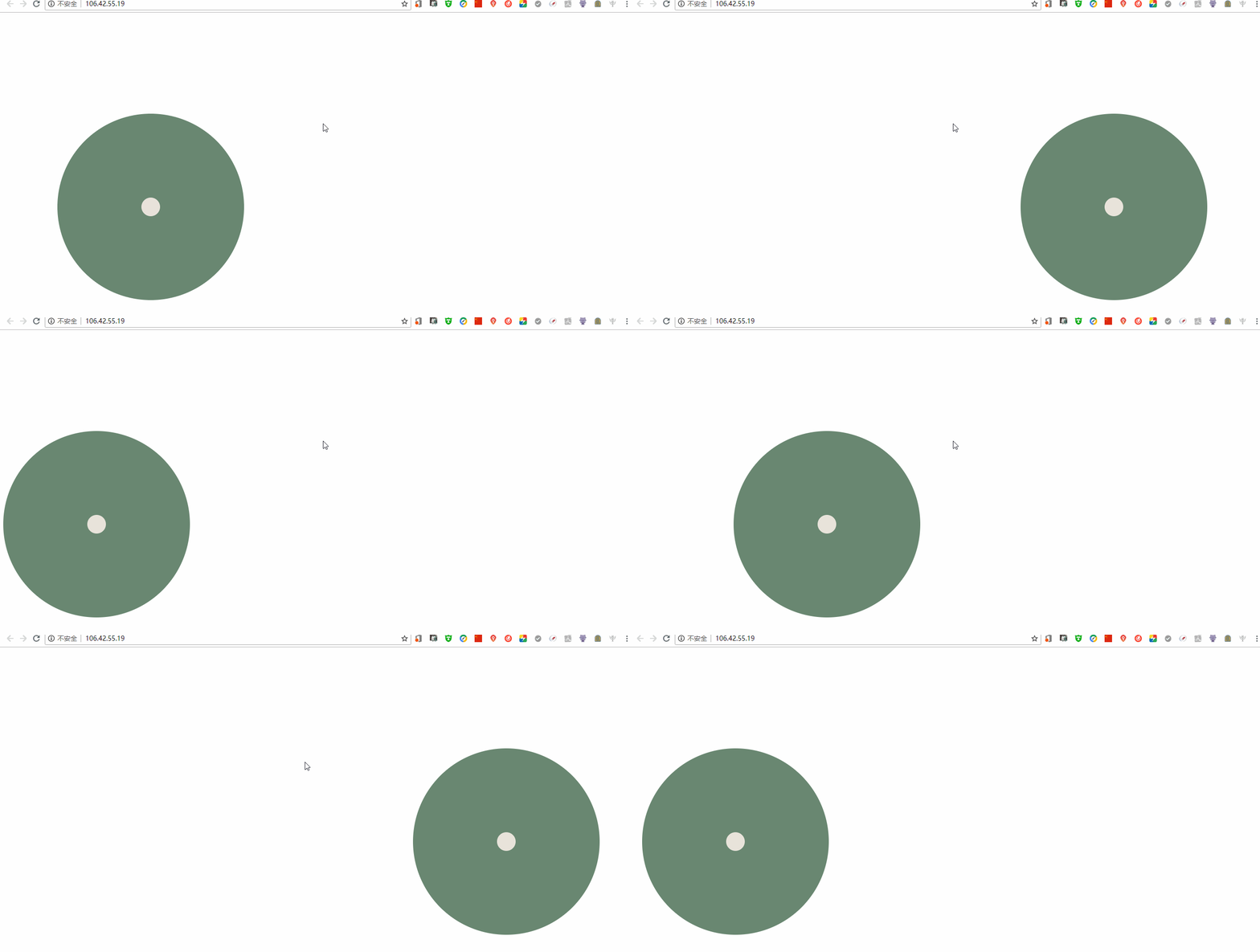
reverse
倒序播放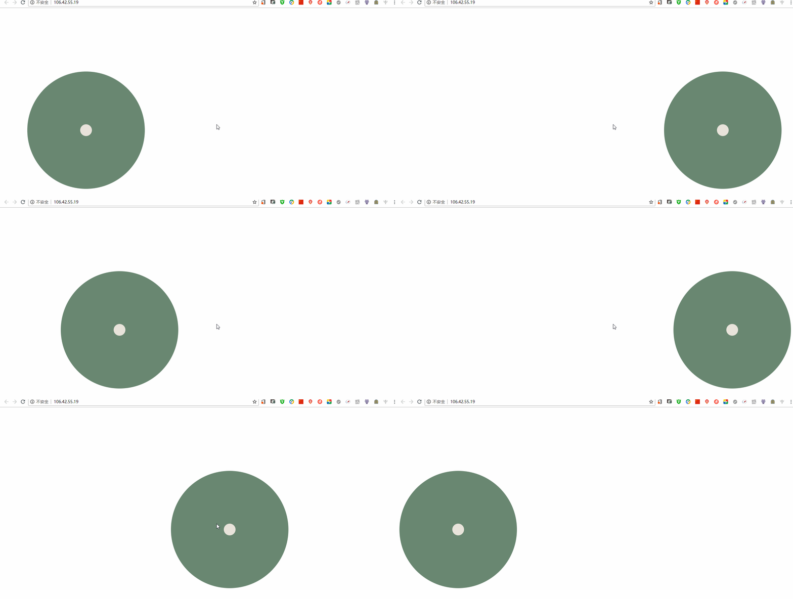
alternate
奇数正向播放
偶数倒序播放
即来回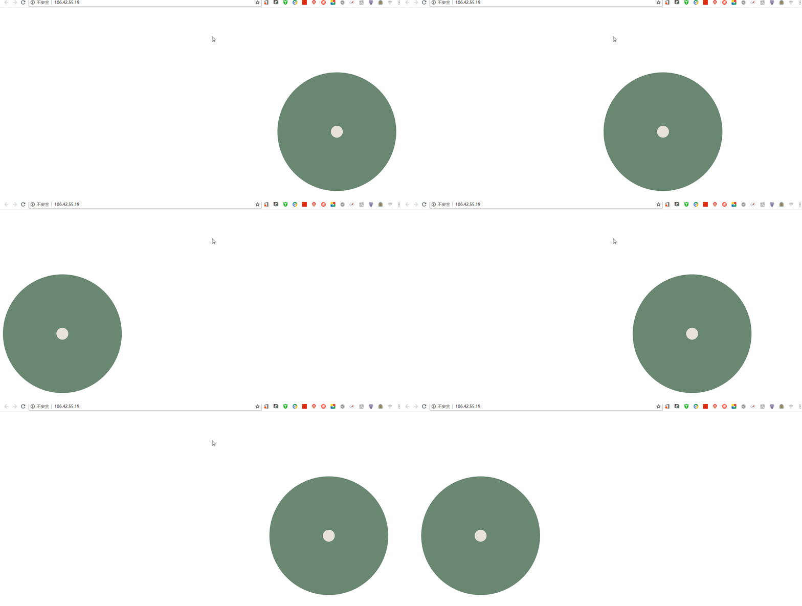
alternate-reverse
奇数倒序播放
偶数正向播放
即倒来回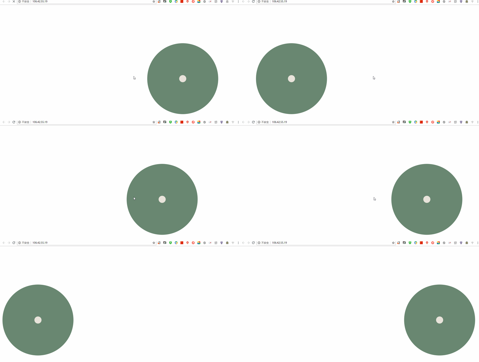
ps 动画具有继承的属性
animation-fill-mode
forwards
将会保留最后一个关键帧,让其停留。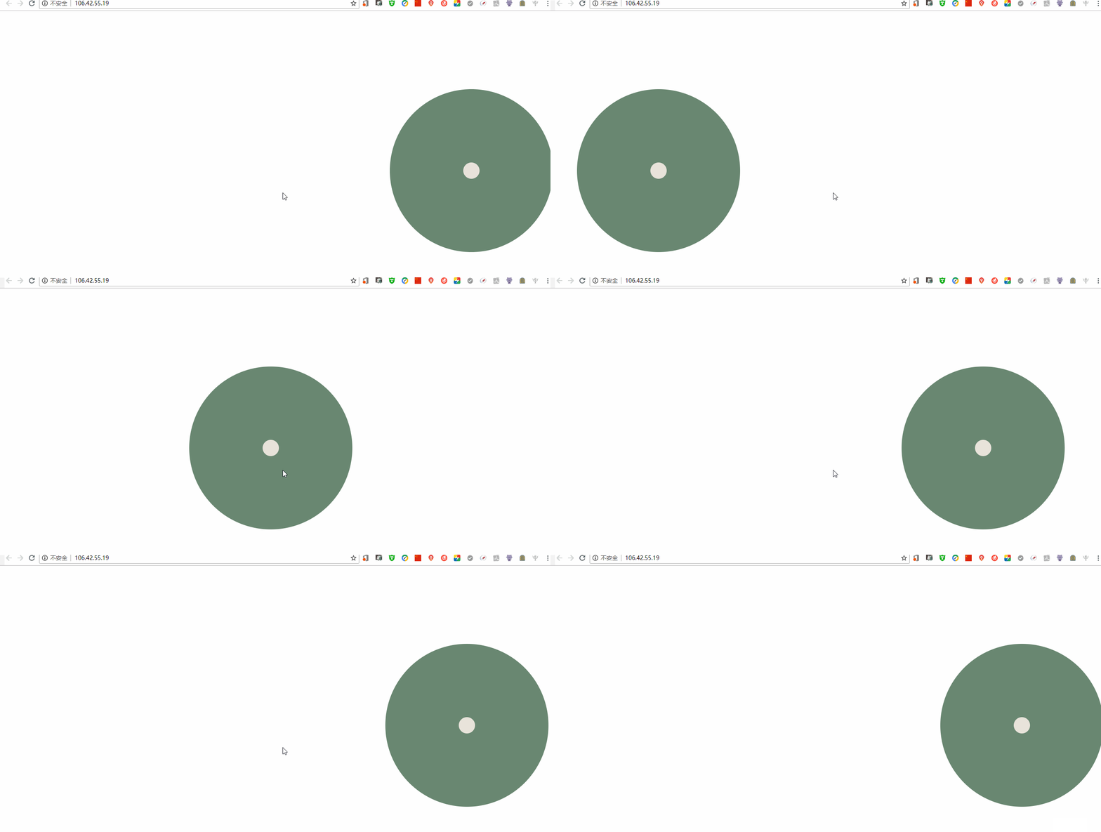
css
/*animation-iteration-count:infinite;*/ animation-direction:alternate; animation-fill-mode:forwards;backwards
将会应用第一个动画值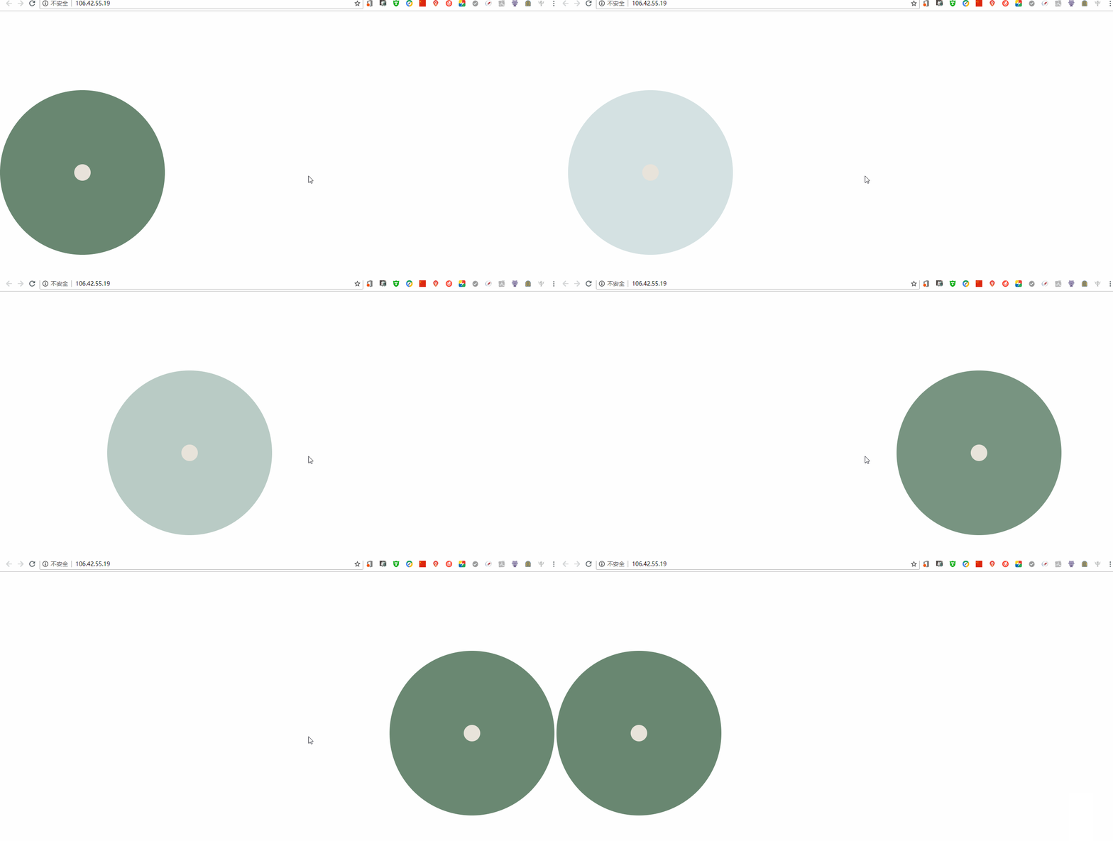
和none的区别在于none使用默认的css样式,backwards将会使用动画的第一帧
/*animation-iteration-count:infinite;*/ animation-direction:alternate; animation-fill-mode:backwards;ps 加上注释的原因是因为如果不加将会重复播放。
both
将会遵守倒序还是正序的停留
正序
/*animation-iteration-count:infinite;*/ animation-direction:normal; animation-fill-mode:both;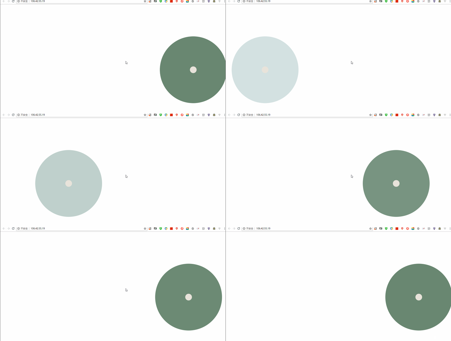
倒序
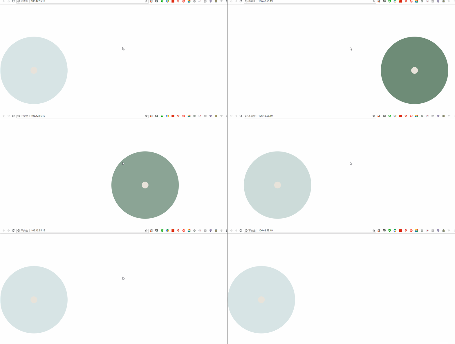
/*animation-iteration-count:infinite;*/ animation-direction:reverse; animation-fill-mode:both;总写
按照上方顺序即可
css 如下
* { margin:0; padding:0;}body { position:relative;}div { width:400px; height:400px; position: absolute; left:0; top:0; bottom:0; margin:auto; background:#698771; border-radius:1000px; animation:my s 5s cubic-bezier(0.785, 0.135, 0.15, 0.86) .5s infinite alternate both;}div div { width:40px; height:40px; position:absolute; left:0; right:0; top:0; bottom:0; margin:auto; background:#e8e3da; animation-name:myCenter;}/*关键帧*/@key s my s { from { left:0; } to { left:70%; }}@key s myCenter { from { left:0; } to { left:0; }}<!DOCTYPE html><html><head> < charset="utf-8"> < rel="stylesheet" href="./index.css" type="text/css"> < >css动画</ ></head><body> <div> <div></div> </div></body></html>< src="./index.js"></ >演示效果 https://melovemingming.gitee.io/code/practice/web/08/10/
继续阅读与本文标签相同的文章
js 和 css动画
-
数据库领域一些概念介绍
2026-05-26栏目: 教程
-
MySQL之my.cnf配置文件
2026-05-26栏目: 教程
-
Linux之init.d、rc.d文件夹说明
2026-05-26栏目: 教程
-
搭建Consul集群
2026-05-26栏目: 教程
-
java io之管道流
2026-05-26栏目: 教程